Subway tiles – the white 3-by-6-inch ceramic rectangles we’ve grown so fond of over the years – are now a staple in bathroom design.
Classic and simple, subway tile is an affordable choice that continues its legacy of making well-loved spaces easy to clean and even easier on the eyes. (They may even help boost your home’s market value.)
The beauty of subway tile lies in its versatility. Not only does it honor the character of historical spaces, it also complements minimalist and modern decor.
Traditional subway tiles are white, flat, glazed ceramic tiles typically applied horizontally with very thin grout lines.
Today there are so many new takes on this classic material that the possibilities for making a striking statement seem endless.
Here’s a look at some favorite subway tile looks for the bathroom.
Go dark: contrast with grout
Subway tile is more popular than ever, but you can still create a unique look with it. A move as simple as using a dark grout color can make a statement.
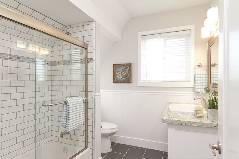
This traditional shower space is a perfect example of how dark grout adds visual variety and pattern while keeping a neutral palette.
Pairing traditional white subway tile with a darker grout adds a pop of contrast and gives a bathroom space more dimension. Dark grout will also make your life easier because it doesn’t yellow and stain as much as lighter colors.
Add wonder with wainscoting
Like subway tile, wainscoting was introduced to interior design several decades ago. Combining form with function, it enhances the look of any bathroom, and protects the lower half of the walls from damage and dirt.
What’s great about wainscoting is its ability to turn a plain wall into one with several decorative elements.
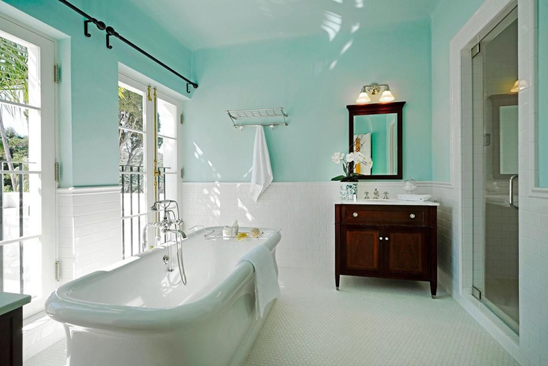
In the bathroom pictured above, the contrast between the brightly colored aqua walls and subway tile wainscoting is eye-catching and elegant.
Switch it up: color and material
Do you like the look of subway tile but want something different? Take a break from standard glossy white tiles and switch it up with a splash of color or a different material.
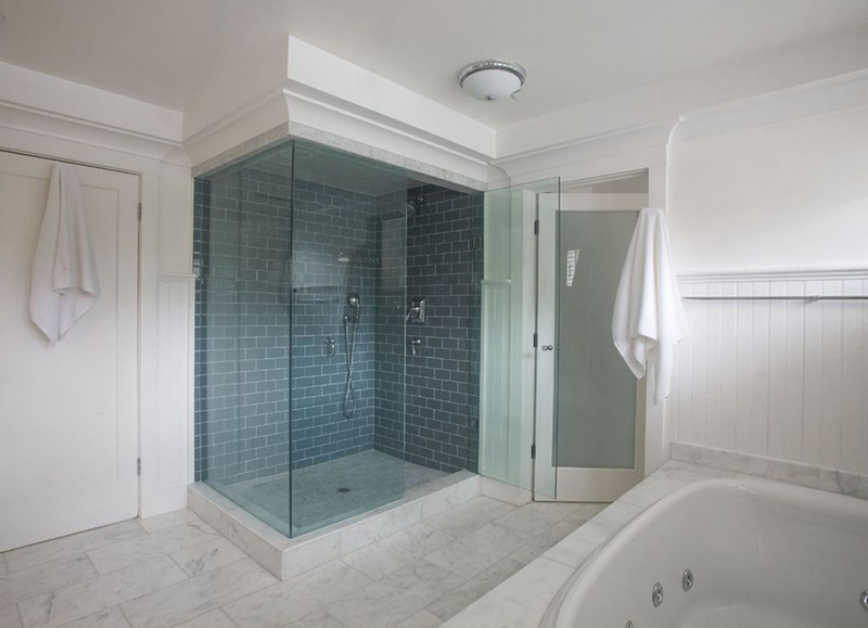
The shower above highlights a traditional brick pattern and complements the classic marble, but adds depth with a field of slate blue.
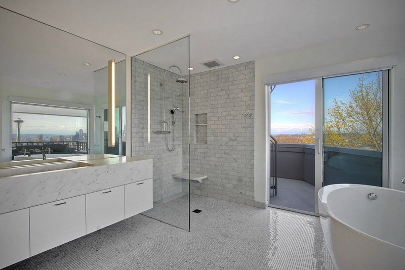
This modern take on subway tile keeps the classic shape, but marble adds a fresh, contemporary vibe.
Pretty patterns
Something as simple as switching up the tile pattern can add a lot of visual interest to your bathroom. The beauty is that you use the same affordable tile, but just change its pattern or direction – no need to invest in additional materials.
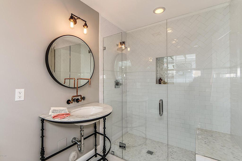
This bathroom features an exciting decorative element by pairing a herringbone pattern with the traditional horizontal layout.
Have a compact bathroom? Emphasize the height of a smaller space with vertical subway tiles – it adds an innovative twist without being too trendy.
Check out Zillow Digs for more home design inspiration.
Related:
