Some home redesigns tackle issues like poor traffic flow and lack of storage. Others address outdated color palettes and unattractive features.
The second floor of this traditional Sacramento home faced all these problems. The three bedrooms and bathroom were begging to be reinvented with a 21st-century makeover.
Adding form and function
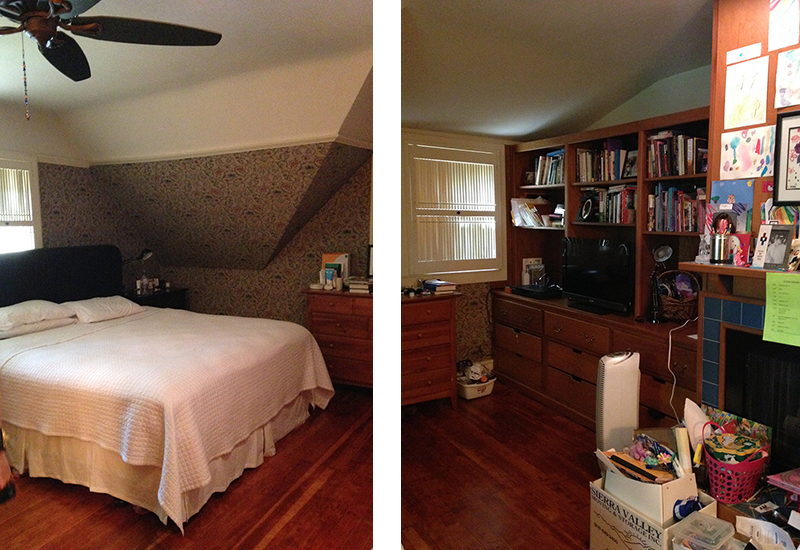
Bright pink paint, outdated wallpaper, and unseemly wooden elements were just the surface issues the homeowners faced. Two of the bedrooms and the bathroom required extensive updates, both architecturally and superficially. Both the master suite and child’s bedroom had many areas that lacked function and purpose.
The first step was to take odd and out-of-place elements out of the mix to create a clean canvas. Our design team removed architectural elements like quirky transitions and spaces, and prepared the rooms to be reinvented.
Next, the team decided which elements should go into the space to better represent the family and their lifestyle. We chose a cool and calming color palette to complement the home’s distinct architecture.
Master bedroom
The master bedroom lacked functionality and room for storage, not to mention a cohesive aesthetic. The design team set out to create a cool and serene space for two busy parents. The first priority was to tear off the old-timey floral wallpaper and clear out the space.

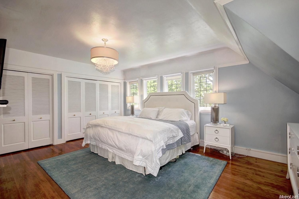
The couple needed substantial storage space and plenty of room to move around without bumping into a dresser or wall.
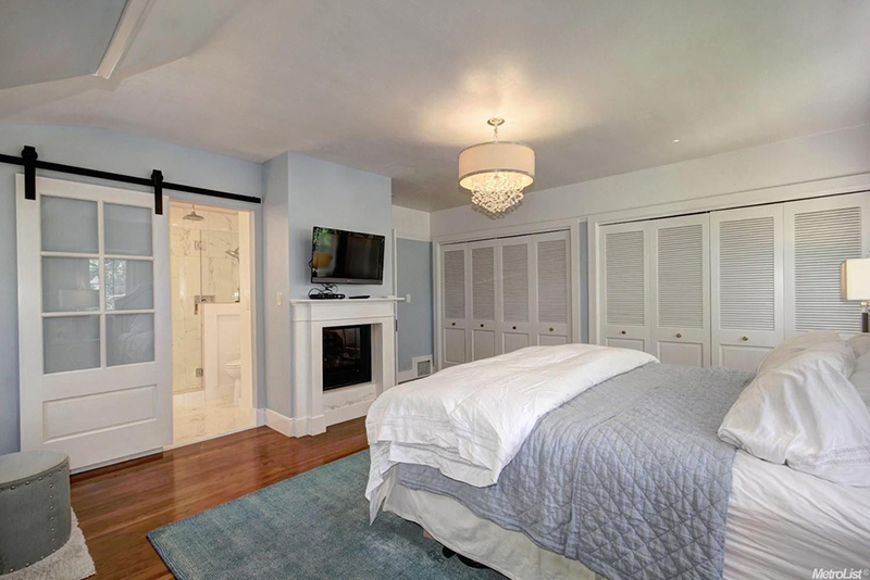
We also wanted to create a cohesive and comfortable look with cozy bedding and simple accessories.
Master bathroom
The bathroom wasn’t completely out of fashion, but it was dysfunctional – especially for the family to share. It needed a brand-new layout.
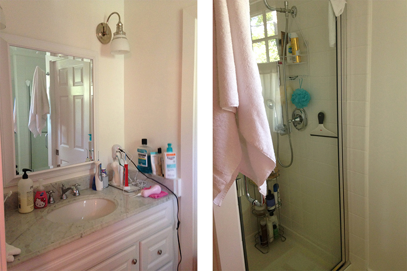
The bathroom was completely reconfigured, with the door and walls removed and space made for a freestanding bathtub.
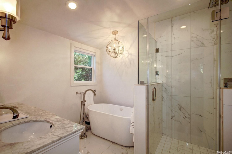
With updated lighting and a neutral paint color to replace the poppy pink and burgundy accents, the bathroom now offers an open, shareable space. Transitional-style tiling, surfaces, and fixtures match the rest of the home’s aesthetic.
Child’s bedroom
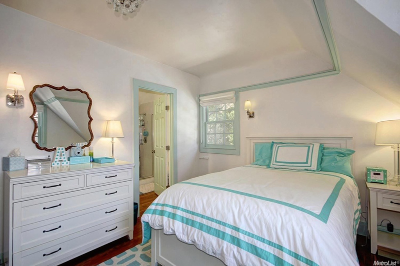
To make the homeowners’ daughter’s bedroom truly picturesque, the design team remade the space with a brand-new color palette, updated lighting, and new furniture.
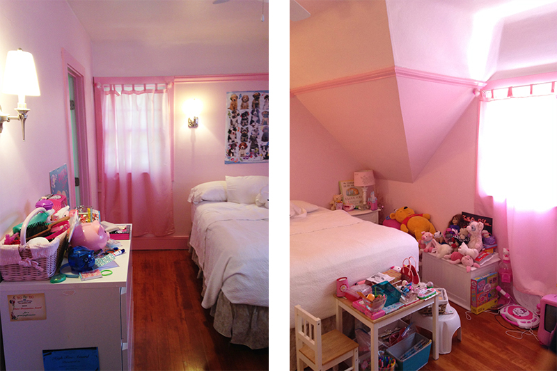
Bright teal and white made the bedroom come alive and show off the home’s best architectural elements.
Guest bedroom
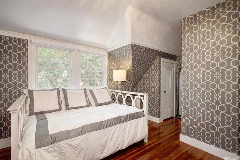
What was once a storage room became a functioning guest bedroom.
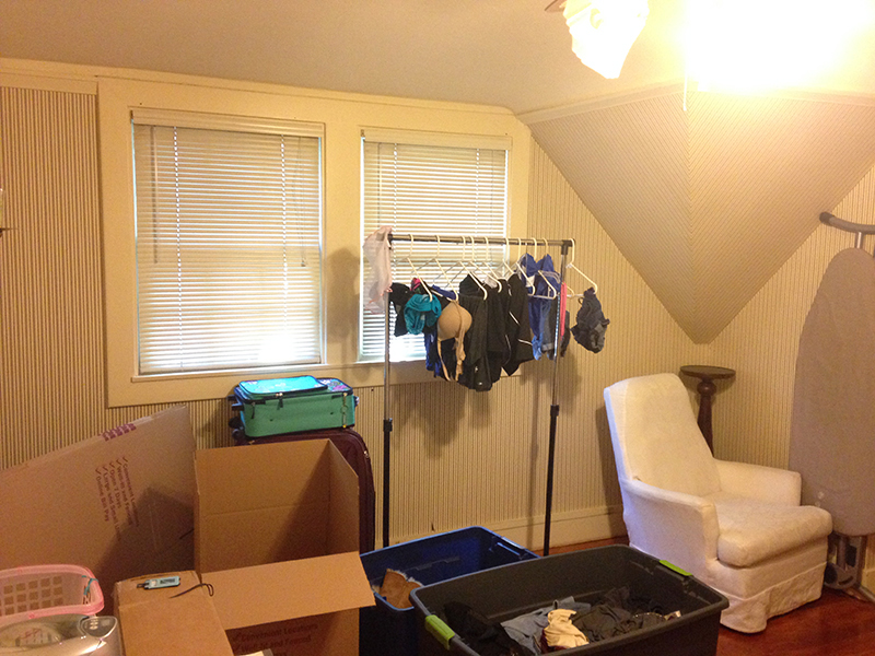
The design team decided to move in a cool and contemporary direction by adding window coverings, a new color palette, new furnishings, and updated lighting to the guest room. Gray-and-white geometric wallpaper contributes dimension, and a daybed perched in the corner awaits overnight guests.
Images courtesy of Valado Mori via Lyon Real Estate.
Get more design inspiration on Zillow Digs.
Related:

