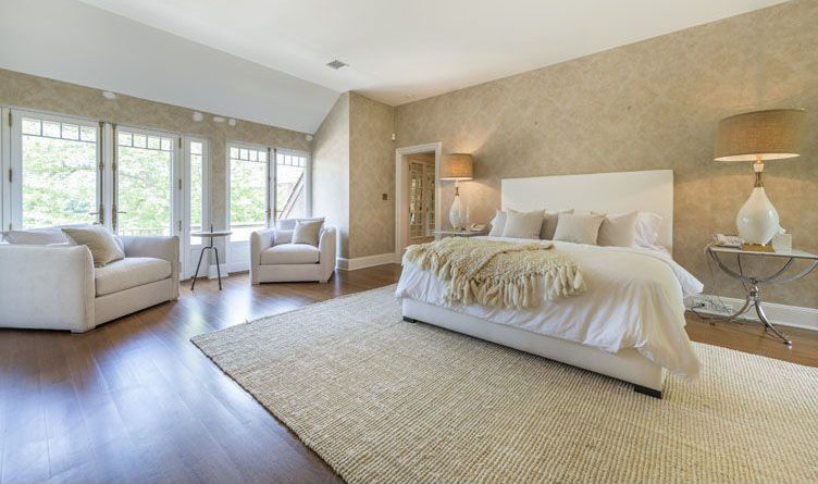
Given the interest in all things natural these days, it makes sense that beige is making a comeback.
Danish design brand Ferm Living’s autumn/winter collection featured caramel-coated doors framed by bubblegum-pink walls. Even New York City designers have chosen beige for its ability to warm up interiors, and many find it reads as a natural material, not unlike marble or wood.

We asked a couple of pro-beige designers to share their tips for working the color into interiors.
Select a luminous color
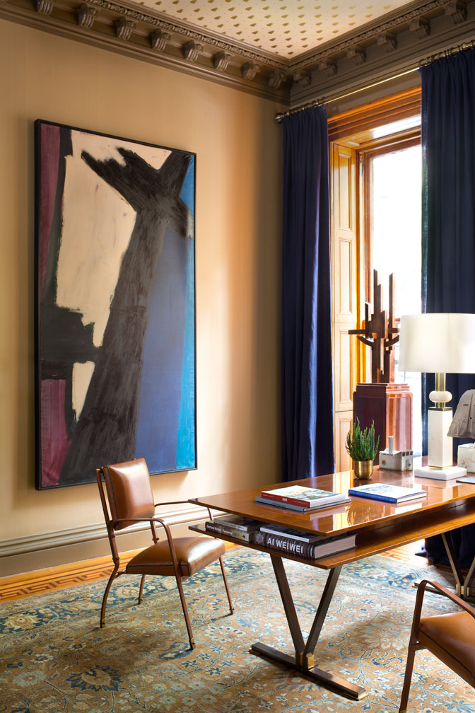
“All colors are not created equal,” says New York interior designer Glenn Gissler, who covered his art-filled room at this fall’s inaugural Brooklyn Heights Designer Showhouse with a terra-cotta stria wallpaper by Farrow & Ball.
“It’s a way to get a very soft, sophisticated background,” he says, “because the stria is a few tones of one color, so it doesn’t read as flat and dull as a beige might.”
Splurge on the paint
“If you’re going to paint, don’t cheap out on the quality of the paint,” says Gissler. “If you go for simple, inexpensive paint, the only colors you can get back are the ones that are in the paint. But if you have a complex mixture, the room will have more luminosity.”

Choose a grayer tone
“If you choose what would be a clear beige, it may look unattractive,” warns Gissler. “Go toward the grayer end of the spectrum.” The idea is to choose something mellow that “doesn’t seem shrill when it’s first painted.”
When testing a color, don’t just paint samples on the wall, where you’ll only see that color in relation to the previous one, Gissler suggests. “It’s better if you do it on a 2-by-2 piece of wood or board so you can hold it in various corners of the room morning, noon and night to see what it does.”
Also, remember that “LED lights can look ghoulish,” Gissler says, so check your color in the context and lighting you’d normally use.
Keep it interesting
Rather than use the same neutral again and again, try to vary your palette with “an interesting mix of cool and warm neutral colors,” says Kiki Dennis, a principal of New York-based firm Deborah Berke Partners.

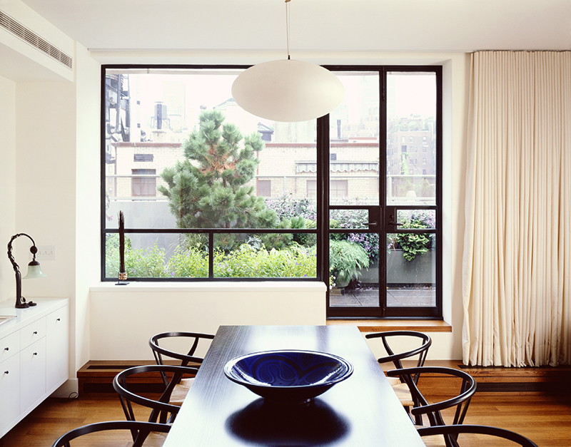
In a 1923 penthouse on the Upper East Side, for instance, Dennis kept the walls a cool shade of beige, while she warmed things up with curtains that had a beige undertone. “Having some variation” in your neutrals and beiges looks more modern, she says.
Shift into neutral
“People like to use neutrals because they’re a great foundation for making things pop,” says Dennis. They’re also a flexible backdrop for those who change their art and home accents often.
“No matter what trends are coming and going,” she says, “there’s always some underlying amount of space where designers resort to a neutral palette,” so don’t be afraid to do the same.
Think of beige as a “medium-light neutral,” offers Gissler, who gravitates toward warm, natural colors. “If you’re going to use beige, it needs to be part of a more complex set of values. You need darker things and lighter things … beige everything? That’s a big bore.”
Related:

