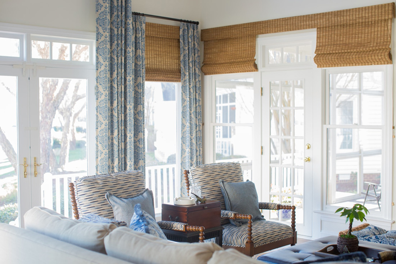
A dated home on the James River in Williamsburg, VA was in need of a face-lift and a coastal touch to echo its waterside setting.
The home, located in Williamsburg’s beautiful Governor’s Land neighborhood, was gutted and updated with timeless materials. Wood floors were refinished in a darker stain, and the walls were painted in a creamy ivory.
While the walls were kept neutral throughout the home, color and personality pop in the fabrics and decor, thanks to the efforts of Jackson Thomas Interiors‘ owner and lead designer Christine Estep, and senior designer Stefanie Powell.

Drawing design inspiration from interior designer Barclay Butera’s coastal homes, the homeowner requested rooms filled with soothing shades of blue and white, organic textures, and brass. The homeowner also had several family antiques she wanted to incorporate.
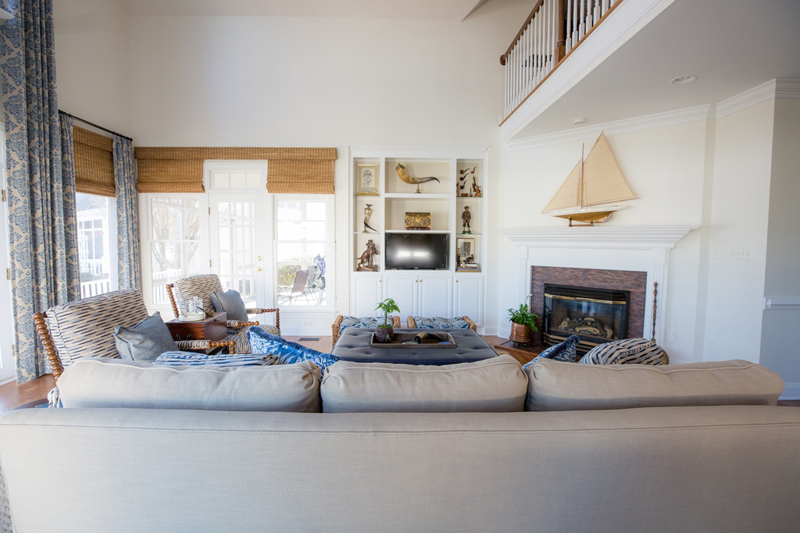
“We focused on doing more of the blue and white shades in the great room, because they really pulled in the traditional feel that the homeowner was looking for, while also tying into the water,” says Estep.
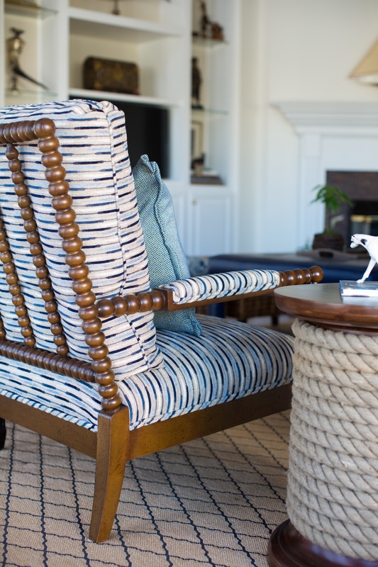
The designers layered textures like wicker, seagrass, brass, and dark woods to warm up the cool, coastal color palette.
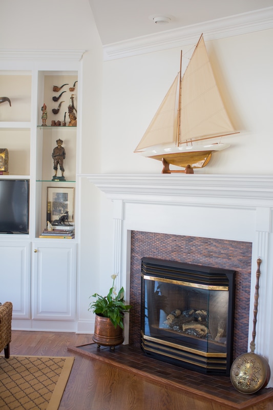
The living room’s fireplace facade was covered in a porcelain custom-blend tile with the appearance of a basket weave – a nod to the natural woven fibers used throughout the home.
Good enough to eat
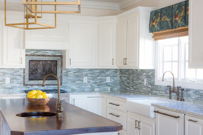
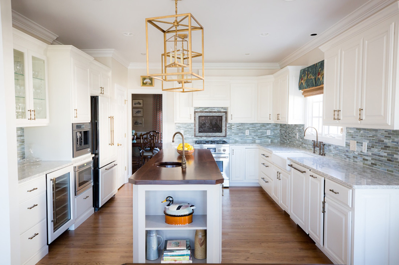
In the kitchen, existing cabinets were updated with a coat of crisp white paint and accessorized with brass bamboo hardware. Berwyn from Cambria quartz countertops with cool gray veining were paired with a sea-glass backsplash.
For contrast, a butcher-block countertop was installed on the island, and oversized brass lanterns add drama and visual interest. Behind the cooktop, an antique tray was transformed into a piece of artwork, framed by sea-glass tile.
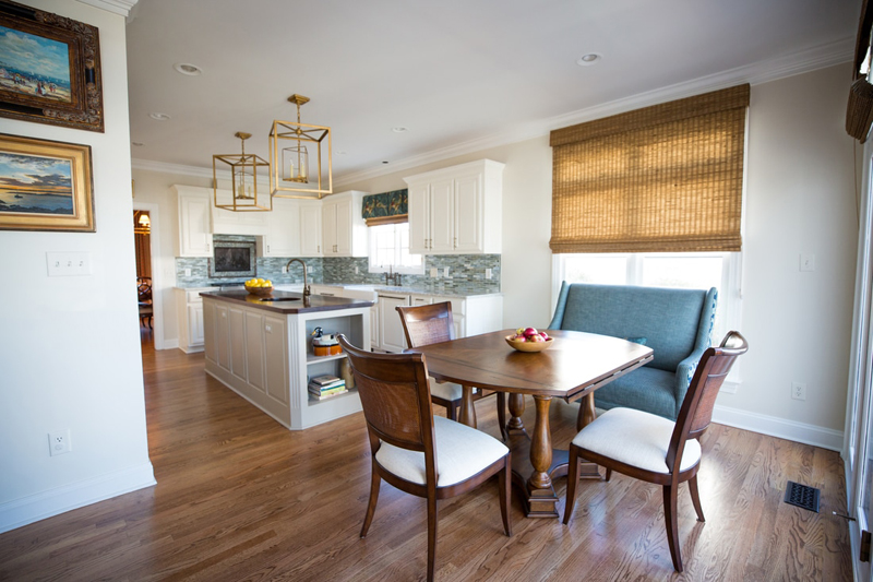
In the neighboring dinette, a banquette upholstered in turquoise and blue fabrics ties back to the sea-glass backsplash in the kitchen, paired with a more traditional wooden table and chairs.
Ready for guests
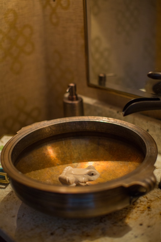
A grass-cloth wallpaper embellished with gold knots provides an elegant backdrop in the powder room. The cozy bathroom is furnished with a small vanity, topped with a copper sink that features a whimsical frog sculpture detail, along with a brushed-bronze faucet and mirror.
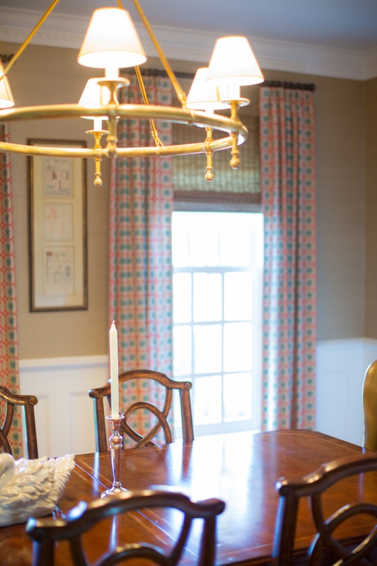
In the dining room, Estep covered the walls in grass cloth and introduced a deep orange to the blue-and-white color scheme to create a more formal atmosphere. Artwork collected by the homeowner adds an elegant and personal touch.
“For the dining room, the light fixture was a big launching point, because the homeowner liked brass, and it had a very nautical feel – like a ship’s wheel,” Estep adds.
Absolutely dreamy
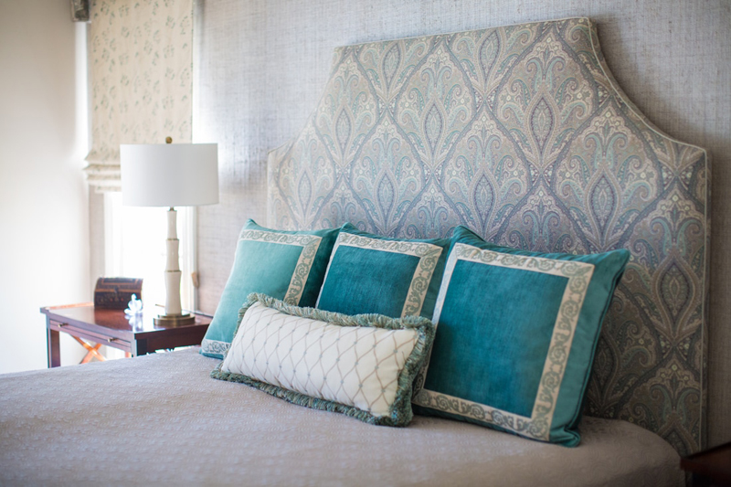
In the master bedroom, all the furniture and accessories, from the window treatments to the pillows and furniture, were custom-made.
A vibrant peacock blue is paired with a subtle blue-and-ivory paisley fabric used to upholster the headboard and cornice boards. Behind the headboard, an accent wall covered in grass cloth adds subtle texture.
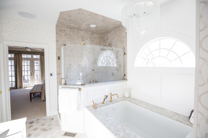
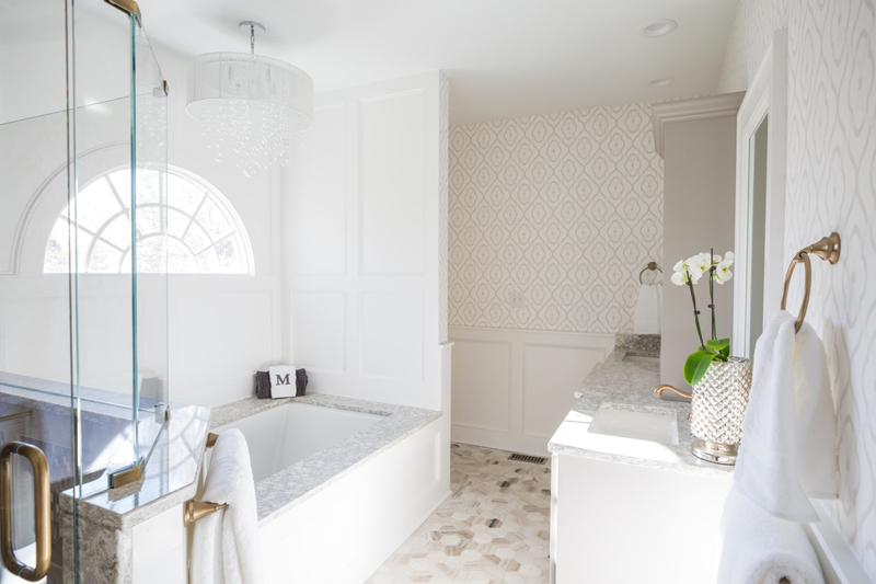
The biggest and most dramatic renovation project was the master bathroom, which was completely gutted and designed so the homeowners could age in place. Wainscoting painted in a cheery white is juxtaposed with a pearlized wallpaper by Fabrica.
Slip-resistant tiles were installed, along with heated flooring throughout the bath and shower. Cambria quartz tops the vanity and surrounds the tub. In the shower, a mix of marble and pearlized tiles are paired with aged brass fixtures, giving the master bath a luxe look.
Get the look at home
- Use stone scraps. A small cut of granite or marble is an affordable and easy way to dress up and customize a ready-made vanity. “You can find a piece for next to nothing and have it cut to fit,” says Powell. The designers found a small remnant that they had cut to 30 inches wide for the powder room vanity.
- Create cohesion with wall color. “In an open-concept home, we always suggest picking one color for common areas – the foyer, great room, corridors – to keep the space light and airy,” Powell explains. “In this home, we chose a shade that was a touch down from the trim color. It really expanded the homeowner’s space quite a bit.”
- Layer texture and colors for personality. “You can make a monochromatic color scheme exciting by changing up your patterns and textures,” says Estep. “It can really make a space look unique.”
See more home design inspiration on Zillow Digs.
Photos by Sara Harris Photography.
Related:

