Interior designer Janie Molster astutely mixes color and pattern to create sophisticated and vivacious spaces. She recently transformed the third floor of a stately residence – located along Monument Avenue in the historic Fan district of Richmond, VA – into a chic and colorful guest suite.
Molster breathed new life into the upper floor by outfitting it with two bedrooms, a living area, a bathroom, and a nursery – all tucked into an attic eave that’s now full of vibrant hues and bold motifs. The end result is a happy home away from home.
“The suite affords privacy and space for all guests,” says Molster. “But when pulling our schematics together, we envisioned our client’s adult daughter and young children staying there. The family of four frequently visits from New York, so we sought a colorful and happy design that worked well for adults and children.”
A fun, functional living space
Initially, Molster and the homeowner talked function. First and foremost, the space needed to be a refuge for guests – a place to relax and watch television on a comfy sofa, make a cup of coffee, and enjoy plenty of privacy.
The launching point for the color scheme was a vintage orange, pink, and white Turkish rug that Molster had on display in her design studio. When the homeowner visited Molster’s office, she spotted it and fell in love.

The rug now resides in the guest quarters’ living room, centering the space. “It has all the wonderful colors we pulled for the rest of the decor,” says Molster. “It brings a funky 1970s shag vibe to the room.”
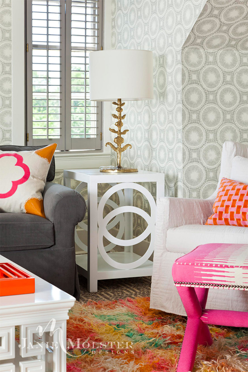
The interior designer outfitted the main living space with a neutral foundation of gray and white, then layered bright colors and graphic patterns to give the area a refined yet cheery feel.
She accessorized with strategically placed pops of orange and pink – accent pillows, footstools, and a tray topping the lacquered coffee table. “We kept a continuum of color throughout,” says Molster.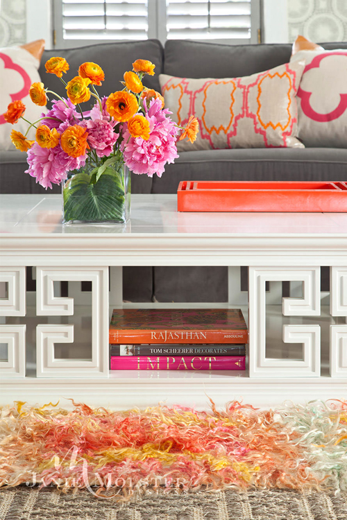
Although the room is family-friendly, Molster didn’t sacrifice style. For kids, the shag rug provides a comfy play zone on the floor, while the coffee table is a good height and size for spreading out toys and books.
“We definitely considered practicality in the living area,” says Molster, who incorporated durable and washable kid-proof fabrics. A cushy sofa is upholstered in a tough, contract-grade gray velvet; arm chairs are dressed in white, washable slipcovers; and two stools covered in a tough fabric are multipurpose, serving as extra seating or a place to rest feet.
A graphic gray-and-white circle wallpaper provides a bold backdrop that’s also easy on the eyes because of its neutral tones. With a low, angular roofline in the attic space, Molster eschewed draperies and painted the shutters and window frames a dark gray instead.
Also tucked in the living room is a kitchenette with a coffee station and mini fridge, much like you’d find in a luxe hotel suite.
Colorwise, the living room acts as a middle ground, blending the hues of the two bedrooms that flank it – a pink kids’ bedroom and an adult orange bedroom.
“While the larger elements in the living room [upholstery and walls] are neutral, we added accents of bright pinks and oranges,” says Molster. “Those colors then become a single color focus of the bedrooms, with one in a melonlike orange and the second in pink.”
Colorful, cozy bedrooms
In the adult bedroom, Molster used an orange quadrille leaf motif to paper an accent wall and upholster the headboard. “The headboard actually ends exactly where the wall turns,” says Molster. “So, we had to maximize the height there and soften the area where people rest their head to read in bed.”
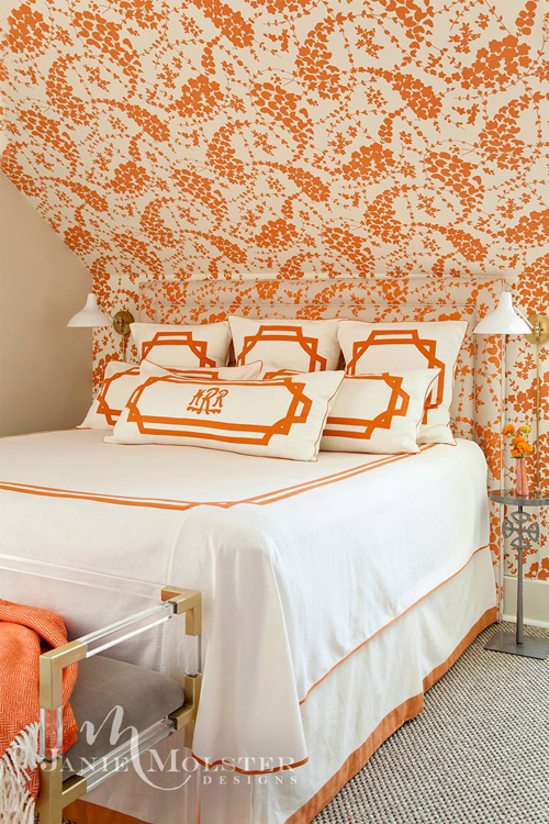
Because the guest quarters are tucked in the attic, the roofline’s funky angles proved cumbersome when decorating. In lieu of nightstands and table lamps, Molster used petite pedestal tables and sconces. “In a tight situation, I always love using these wall-mounted lamps,” she says. A lucite and metallic bench at the foot of the bed offers up a place to put a suitcase.
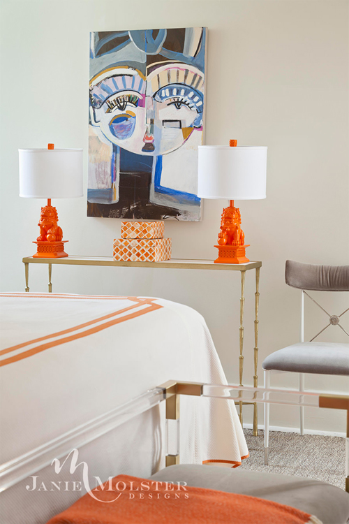
Juxtaposed by two orange, lacquered “foo dog” table lamps, a blue abstract painting by Atlanta-based artist Sally King Benedict adds a cool contrast to the warm tones throughout the room.
The kids’ room is outfitted in pink floral wallpaper by Romo. Molster incorporated the homeowner’s childhood bed, and had a custom mattress made to fit its unique dimensions.
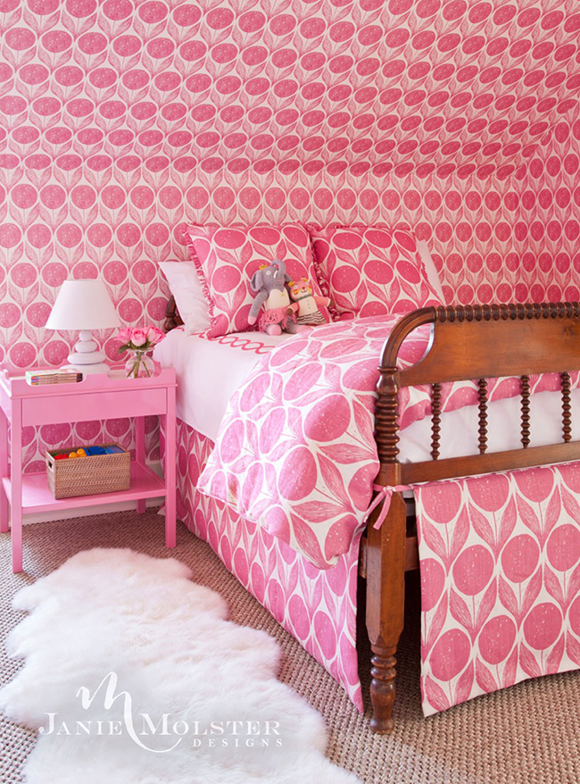
“We used wallpaper liberally throughout, and because we kept the patterns to a minimum, the rooms still seem pared down and straightforward,” says Molster. “This is particularly true in the bedrooms, where we used a single pattern on both walls and headboard fabrics. Rooms like these are some of our favorite rooms to wallpaper. As the suite is on the home’s top floor, there are many charming attic-type eaves and dormers to accentuate the pattern play on the walls.”
Get the look at home
Follow Molster’s tips and tricks to play with color and pattern in your own home.
- Find something you love and use it as your decorative launching point. “It doesn’t need to be something obvious,” says Molster. “I just read a design article about a gorgeous yoga room inspired by a green Birkin handbag.” In this case, Molster’s client was drawn to the pink and orange Turkish rug, which became her source of style inspiration.
- Create a symmetrical space, then add oddities. “The eye and the brain love symmetry,” says Molster. “If you have a room you can easily arrange with an anchoring piece [like a sofa] flanked by pairs [chairs, end tables, lamps, and pillows], you’re off to a great start. We prefer to start with symmetry, and after we achieve it, we mess it up by adding an odd chair or random pillow – something imperfect.”
- Pick a pattern and go after it. “Our clients usually respond quickly to patterns, and if they instinctively love it, we send them home with a sample to ponder for a bit longer,” she says. “If the pattern still sings after a couple of weeks, we encourage clients to use it liberally. Patterns used in abundance tend to ‘quiet down.’ Think of wonderful French toiles blanketing rooms on walls, upholstery, curtains, and lampshades.”
Get more design inspiration on Zillow Digs.
Photos courtesy of Janie Molster Designs
Related:

