The team at Marc-Michaels Interior Design knows how to create stunning spaces – even when the objective is to keep the space simple.
Senior Marc-Michaels designers Jessica Lee and Rachel Ortiz share the elements they used to give this new construction, mid-century modern-inspired Florida residence a minimalist feel without sacrificing style.
A neutral palette
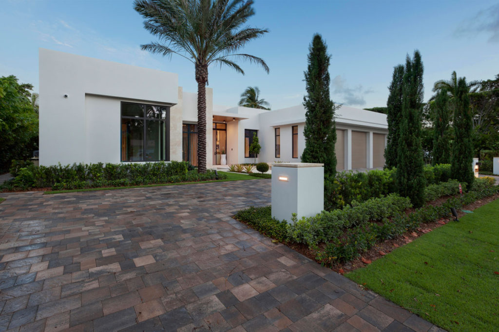
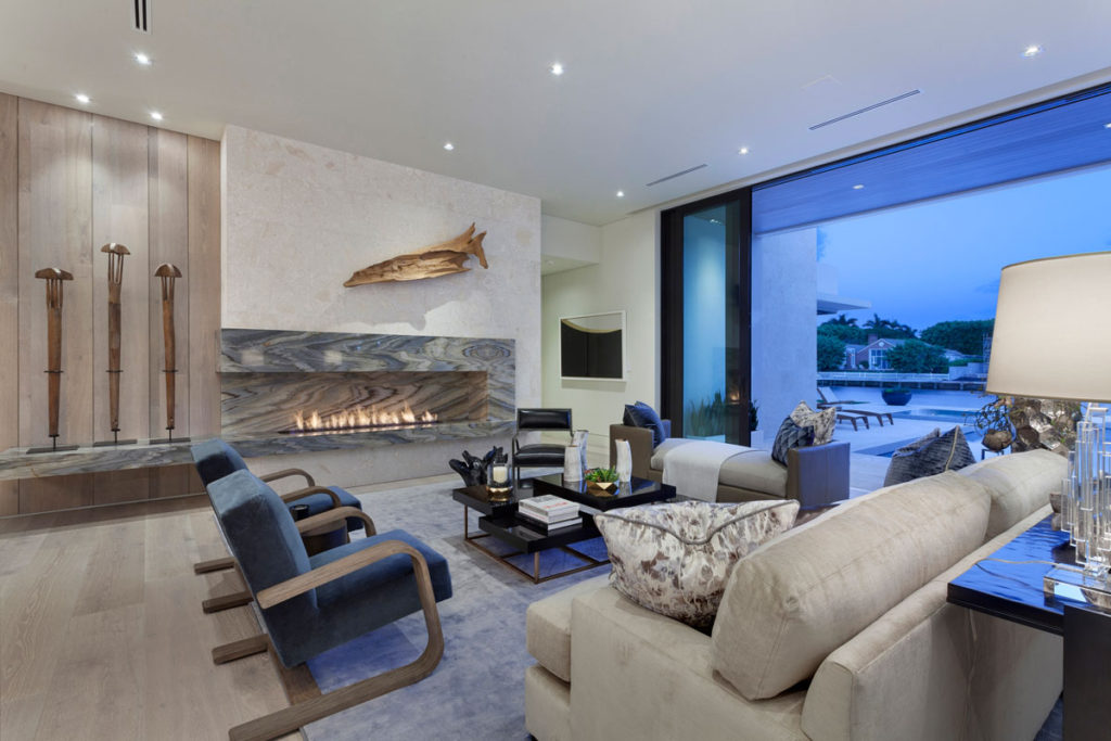
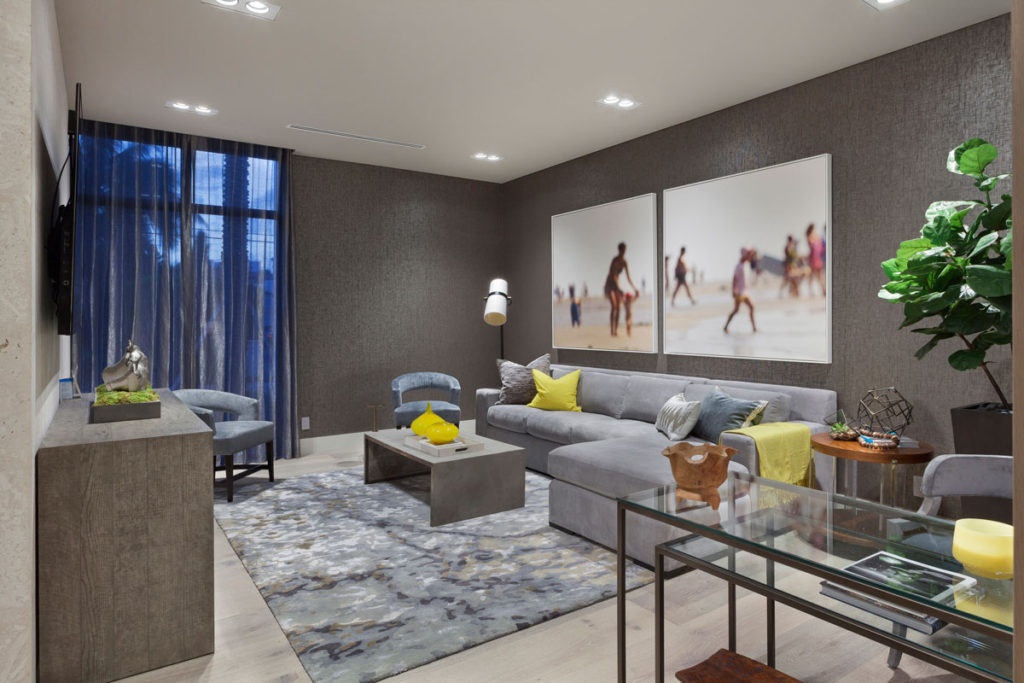
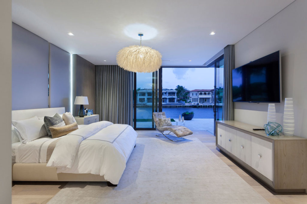
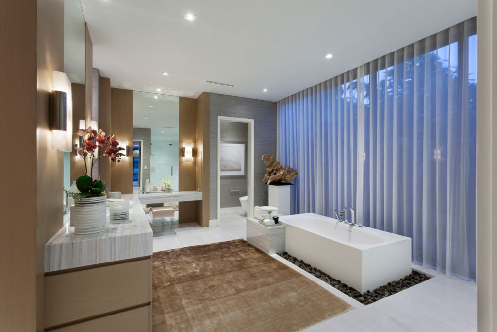
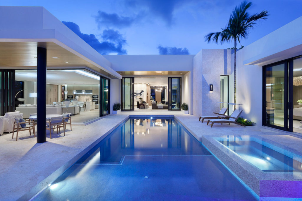
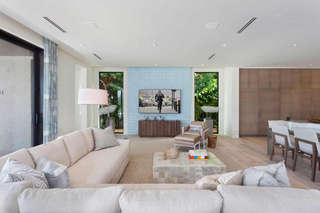
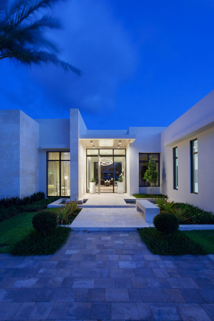
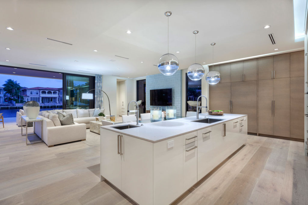
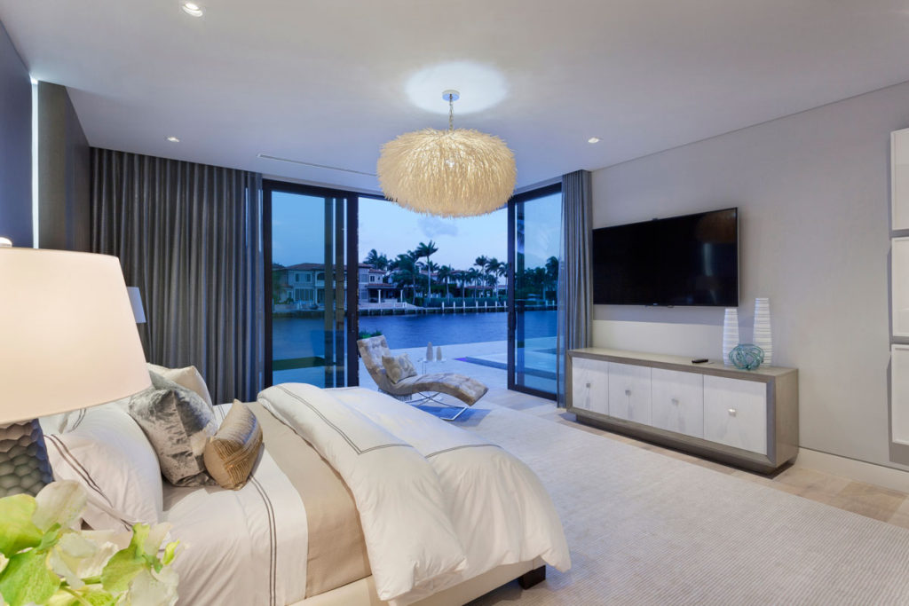
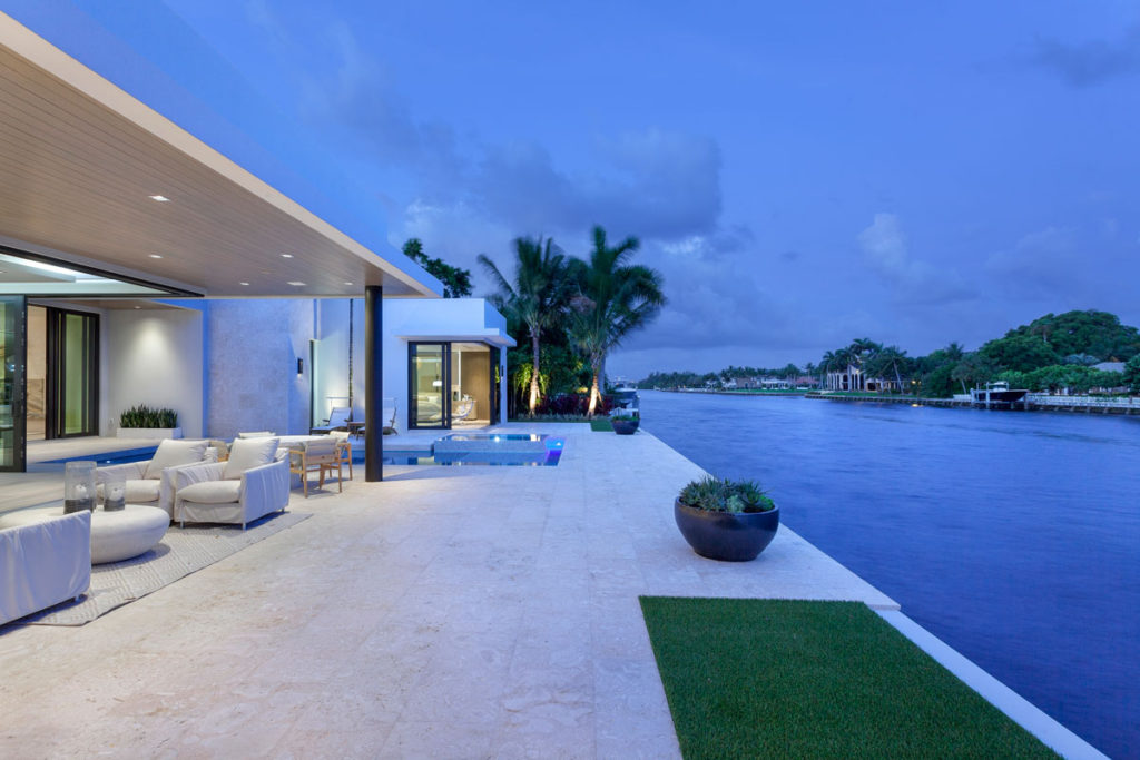
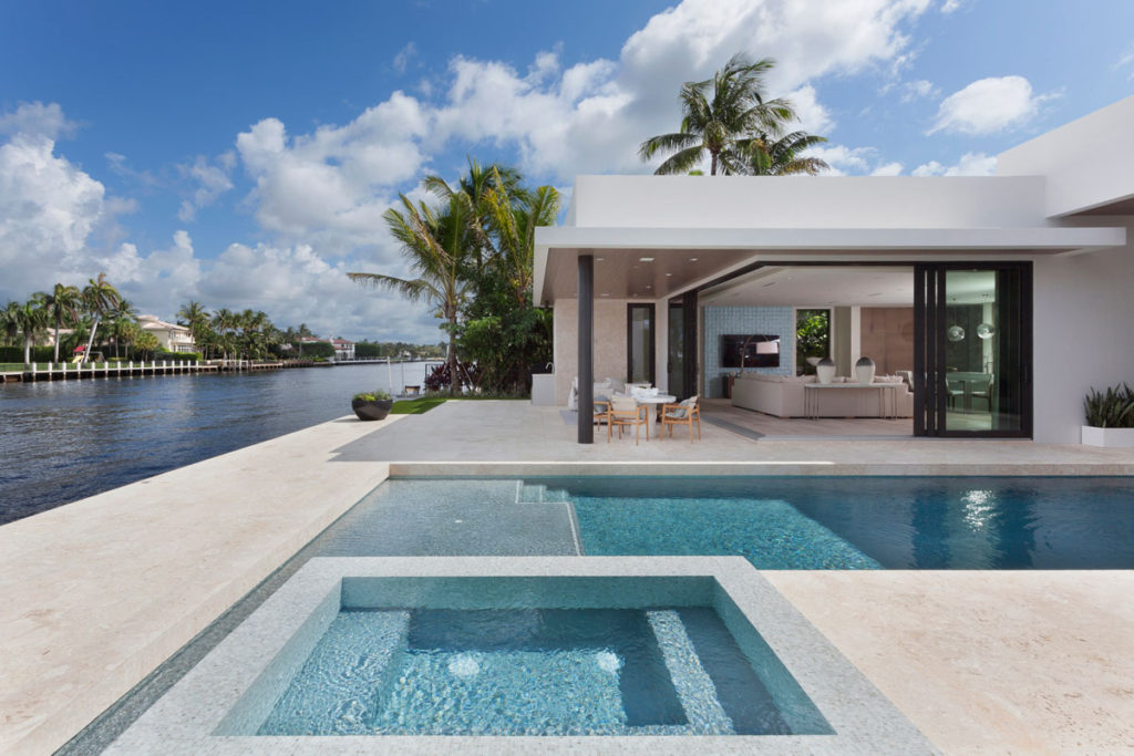
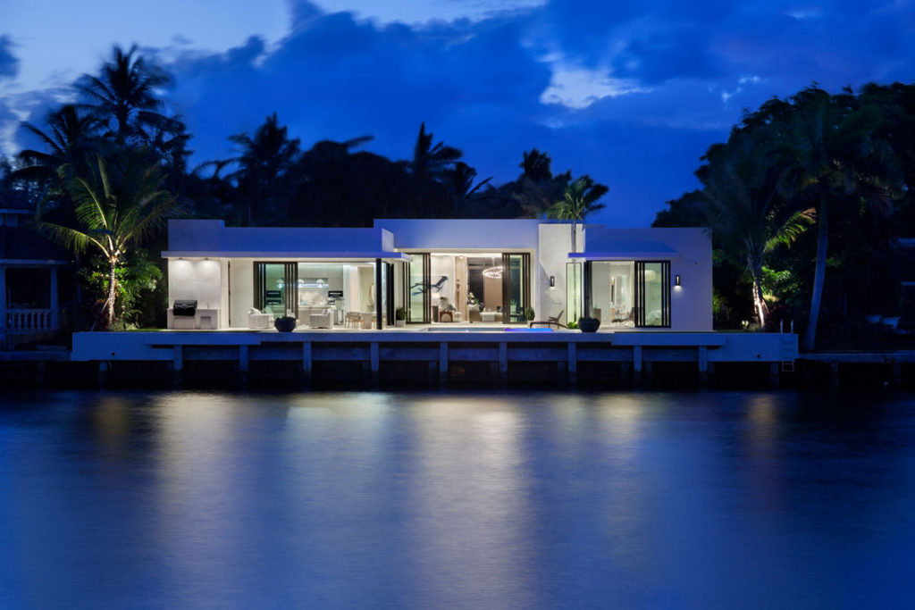
The owner and builder of this home had a vision of clean lines and a boxy look, with an open floor plan where the spaces would flow. Lee and Ortiz carried this architectural vision into the design with a neutral palette consisting of limestone flooring and a single paint color throughout most of the house. Wood accents add warmth, while touches of blue, sparingly used, bring in cool tones for balance.

Focal points for each space
Sometimes a focal point needs to be intentionally crafted, while other times it just needs to be called out.
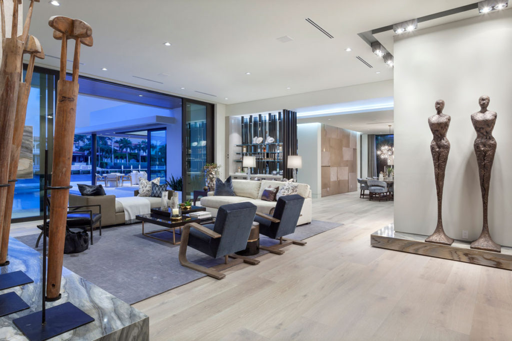
This home’s backyard overlooks the Intracoastal Waterway. Floor-to-ceiling glass windows along the back help draw your eyes to the view as soon as you set foot into the foyer. The rest of the decor for the living room was carefully selected to keep the focus on the view.
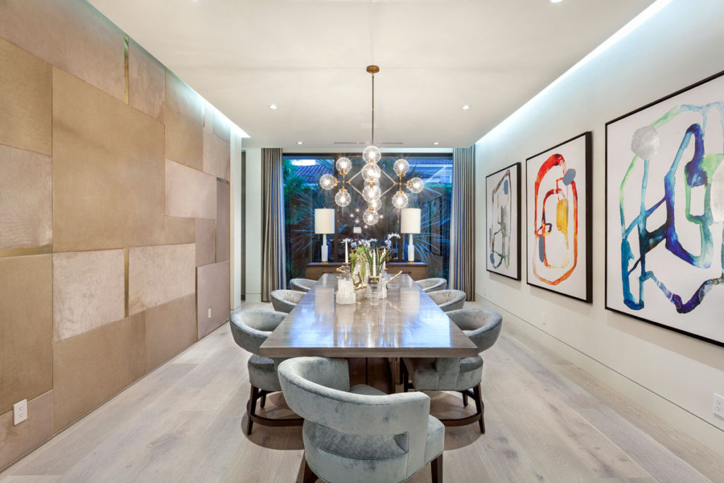
In other rooms, where there wasn’t an obvious focal spot, Lee and Ortiz saw opportunity. For example, in the dining room, they created a focal spot by covering an entire wall with upholstered leather panels and white bronze metal pieces in a geometric pattern. The unique wall fits in with the neutral decor, but also draws attention to the design details.
Sprinkles of dramatic decor
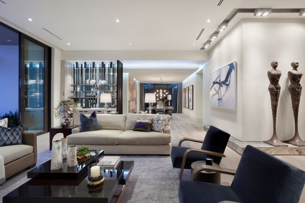
“One of the features we loved doing is the bar,” Ortiz says. “The idea was that the builder wanted a bar off the living room, but we didn’t want it to be too open.”
The designers used this opportunity to partially section off the living room and add a pop of color by creating a one-of-a-kind bar made from dark metal posts. They drilled the metal beams into the floor and ceiling, and then attached glass shelves directly to the beams.
Carefully selected touches – such as the bar, the upholstered wall and a mixed stone fireplace – give the home character without detracting from the overall simplicity.
Gallery lighting
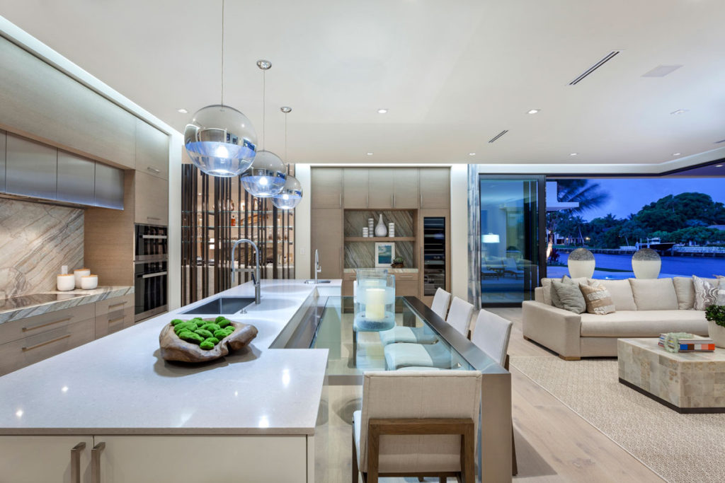
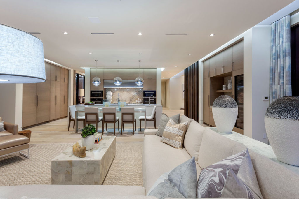
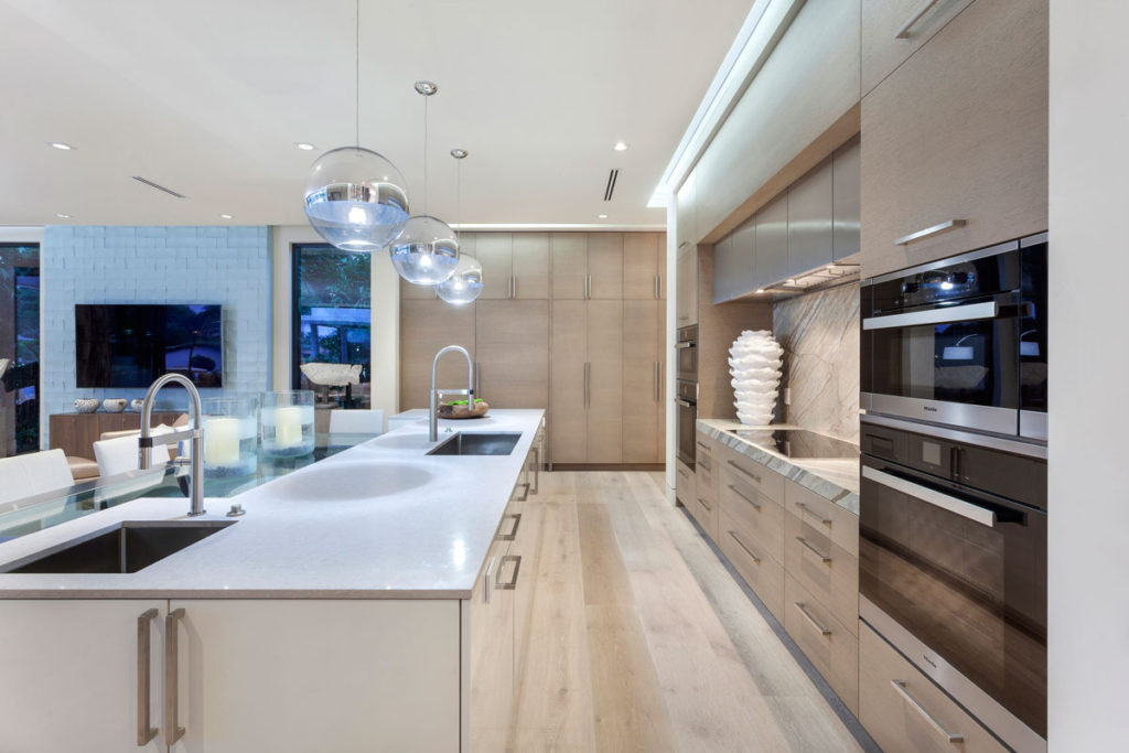
In order to really drive a clean look, the Marc-Michaels team chose recessed track lighting and cove lighting. Thanks to the main living space’s open layout, recessed track lighting with adjustable light fixtures give the space a modern, gallery look and actually allows the homeowner to spotlight the artwork on the walls.
In the dining room, the team took advantage of the dropped ceiling and installed cove lighting along the outer perimeter. The diffused hidden lighting gives the room a warm illumination. “We wanted the space to feel modern, but not cold,” notes Ortiz.
See the whole home:
DIY this look
Creating a look that is minimalist but modern and trendy can be difficult. Here are some tips from the Marc-Michaels design team on how to get this home’s look.
- Plan around your neutrals. A neutral palette for your walls and floors will immediately drive a clean look, freeing you up to add color and richness with fabrics, artwork and furnishings without overwhelming your space. “You have to pick your moments,” Ortiz notes. “We started with neutrals, and then added pops of blue.”
- Create an inexpensive panel wall. If upholstered leather panels and metal aren’t in the budget, you can still capture the geometric, grid look with other wall coverings. One option is laying out wallpaper into a similar grid pattern and incorporating pieces of wood painted to look like metal. Another idea is painting a multi-color grid directly on the wall.
- Fake a modern architecture style. While your home’s architecture may not be modern, removing baseboards and crown molding can create a similar effect. The modern, minimalist style usually has flush or recessed baseboards and no crown molding.
- Swap wood for metal. With the help of a metal finish paint and some wood, you can create your own metal bar without the price tag. “The cost-effective way to do it would be to use two-by-fours with a metal finish,” says Ortiz.
- Pick warm lighting. Cove and track lighting are the best options for recreating the feel of this home. But if you can’t swap out your light fixtures, use warm, diffused lighting to prevent your space from feeling cold – one of the common errors and potential downfalls of a minimalist design.
Photos by Ed Butera with IBI Designs
Related:

