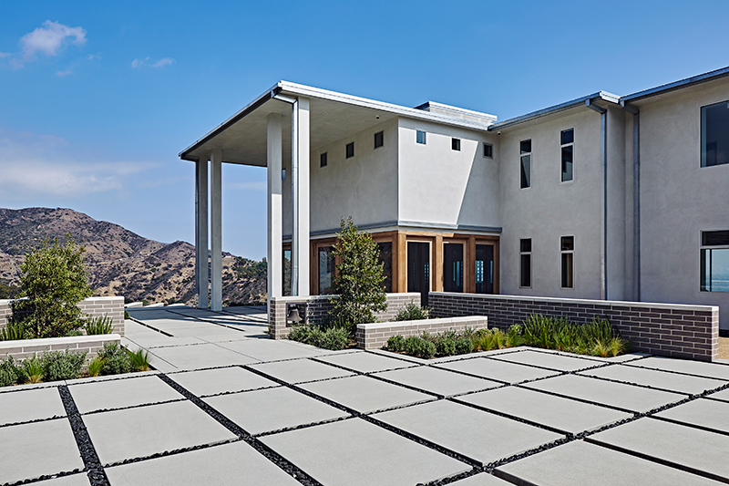
There are open floor plans, and then there’s 23800 Malibu Crest Drive – a sprawling mansion built on the former site of Castle Kashan, a faux-Scottish castle destroyed by a fire in 2007.
The new 5-bedroom home – measuring 10,331 square feet and listed for $85 million – lives up to the grandeur of the previous structure with panoramic ocean views, wide-open spaces and upscale amenities like an infinity pool, wine room and spa. (Its guest house is 4,407 square feet and has 2 bedrooms.)

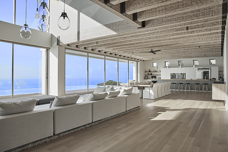
While buyers will surely covet the home’s oceanfront perch, architect Scott Gillen insists it’s the views from the main house that steal the show. “I pretty much envisioned the biggest, widest, most open space I could achieve,” Gillen says of the great room that captures the view.
To avoid building walls on the first floor, he used 187 gluelam beams between the first and second floors – no load-bearing walls exist on the first floor whatsoever. “It’s one massive great room, and within that, I contained a living room, kitchen, dining room, library, and wine and cigar room.”
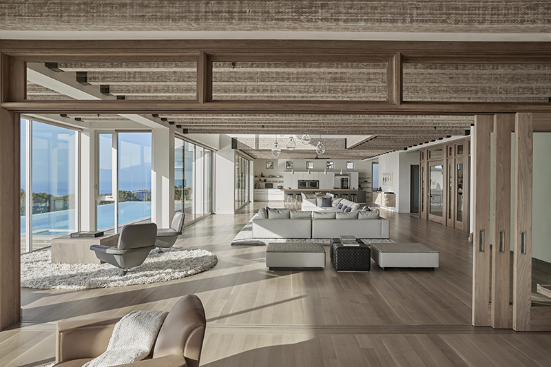
The great room appears to go on forever, unfolding itself as you enter – just like a movie, says Gillen, who is also a film director. “You’re kind of directed to function the way that the layout’s been designed,” he says.
One example of the “invisible ergonomics,” or flow, as Gillen calls it, is the home’s lighting. “When I do a lighting plan, I usually walk through a space and place the switches in areas where you’d naturally reach for a light switch,” he says.
The steps of the staircase, too, rise at a particular height to fit his notion of how a person should move through the home.
Toward the right of the great room, the kitchen announces itself with a “striking” graphite center island, says Gillen. The background cabinets, which are taller, were done simply in white and accented with small pieces of stainless steel. Things that stand out are within easy reach, he adds, while “things you don’t need to see fall back in the background and somewhat blend in.”
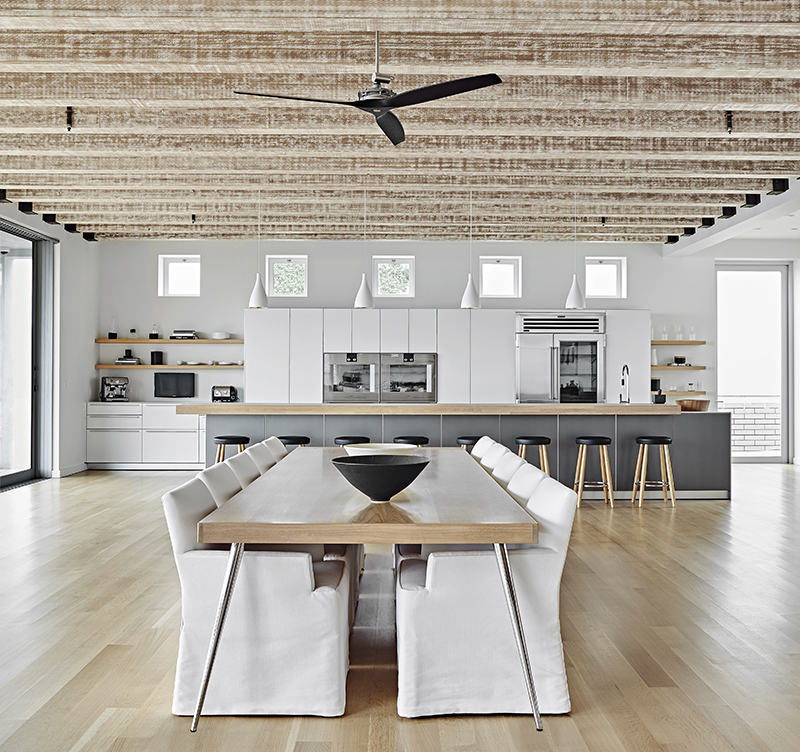
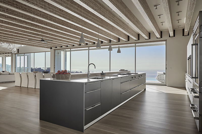
The color scheme was chosen for its ability to not distract from the oceanfront view. “It’s a very, very large kitchen, and if you made it in color, it may feel oversized and overbearing,” says Gillen. “You can miss it, and you could have too much of it – that’s one of the two options with open spaces.”
Another example of this attention to detail are the speakers, which were installed directly into the walls and drywalled over. “They have no visual appearance, but you get great sound,” Gillen says. “It allows the wall to be a blank canvas.”
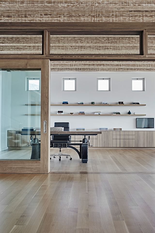
In the master bathroom, an 8-by-8-foot shower and tub made of solid black walnut lend warmth to the space. “When you open the doors, which are facing a creek, you get the sense of being in the open air,” says Gillen. “It’s inviting the outside into the house – it’s the epitome of indoor-outdoor living.”
The floating vanity, he notes, gives the room a sense of height and brings the eye up. “I don’t want you to look down, I want you to look level. It’s just fresher – not contemporary, but fresh. It’s what people are asking for.”

Get the look at home
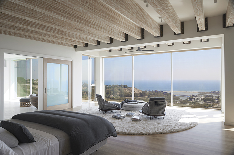
- Let natural materials shine. Gillen chose a “very specific aged oak” for the floors, along with plenty of teak and solid black walnut. By keeping the furnishings subtle, he allowed these materials to speak for themselves.
- Customize where you can. “Most of the furniture is either handmade or custom to fit this specific house,” says Gillen, who spent months hand-sanding the exposed beams. By sourcing 60 percent of the furniture from local outlets, he helped give the home its unique sense of place.
- Set the flow. By grouping the furniture, Gillen was able to mastermind how guests move through the house.
Photos courtesy of UNVARNISHED.
Related:

