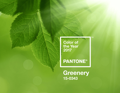
Now fashion houses can complete their 2017 collections, and designers can choose their paints. Pantone has announced the Color of the Year: Greenery, offering “the reassurance we yearn for amid a tumultuous social and political environment,” said Leatrice Eiseman, executive director of the Pantone Color Institute.
Ahhh. Calming color, soothing words.
But Eiseman is far more than a mouthpiece for Pantone’s Color of the Year. She’s in charge of finding it, and she shared some of her secrets before traveling from her island home near Seattle to Seoul, where she unveiled the cool new hue.
Here’s what Eiseman had to say about:
Being the defining voice in the world of color
“If we believe in it enough to name it Color of the Year, manufacturers and designers will of course jump on the bandwagon and get excited by it. They’ll say, ‘Wow, pink and blue, who’d have thought [from 2016’s Rose Quartz and Serenity duo]. Maybe we need to make potato peelers – one in pink, one in blue.’ Some were already on that path before they heard us, and it helps to validate their choices.”
Feeling for the color
“We have to look for colors in ascendancy. You feel for it. You start to see certain colors on the periphery. We see little nuggets of information that come from the art world. It could be an artist who has come to prominence. For the 2016 colors, it started when I was asked by the Tate in London to critique Agnes Martin’s work. I realized she really loved blue, and all the emotional reasons why, and that she loved to combine it with other pastels, particularly in the rose tones. Her work was appearing in London, Dusseldorf, Los Angeles and New York. Then I picked up a magazine, W or Elle Decor, and there was the apartment of Wendy Murdoch, and above the fireplace was a huge Agnes Martin. Once you let the genie out of the bottle, you go down the path of where else you’re seeing this.”
The effect of home
“Living in the Northwest is a tremendous advantage, in that you get the best light here you can imagine, pure light for viewing color. I’m looking out a north window right now, where I’m seeing gorgeous greenery that surrounds us and contrasts with Japanese maples. I also bring a  West Coast perspective, which in some ways is more colorful, more adventurous in reaching out and taking chances with color.”
Defying color rules
“I just changed the color of a tiny little powder room in my own home. I have a collection of beaded evening purses that are works of art, and I don’t want to hide them in a drawer. So I redid the powder room to showcase them. It’s a maroony, a little bit purply shade, and over that is a sheer gold overlay, so it’s like walking into a jewel box. It defies the rule about painting small spaces lighter colors to make them appear bigger, but you just go in for a few minutes and leave. You should glamorize it and dramatize it.”
Playing favorites
“It’s like asking who’s your favorite child. I think every color has a redeeming feature. If real estate is all about location, location, location, then with color, it’s context, context, context. Someone might say, ‘Really, you like the color puce?’ And I say, ‘It’s classic. I could use a gorgeous topiary teal to spice it up a bit.’”
Loading up on the new hotness
“I am right on it, the minute we know that’s the color we’re going to go with, I am right out there. Sometimes it’s difficult to find that precise color, so I have to push a little bit. I love jewelry and scarves, and I find sandals and ties and fingernail polish. We have a sun porch, and I start taking stuff there, so when I go on a trip, I can deliberately start matching and putting it all together.”
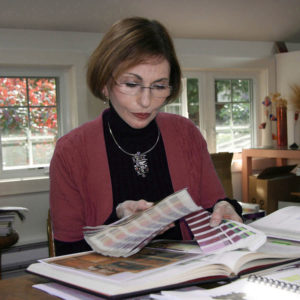
Photo courtesy of Leatrice Eiseman
Related:

